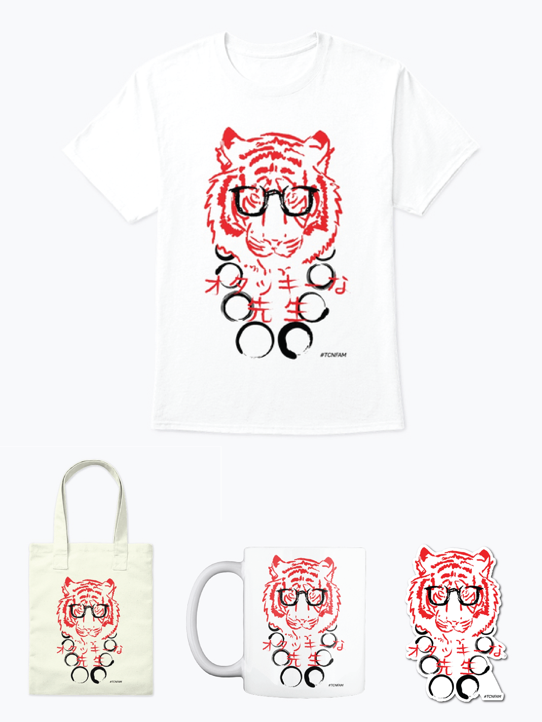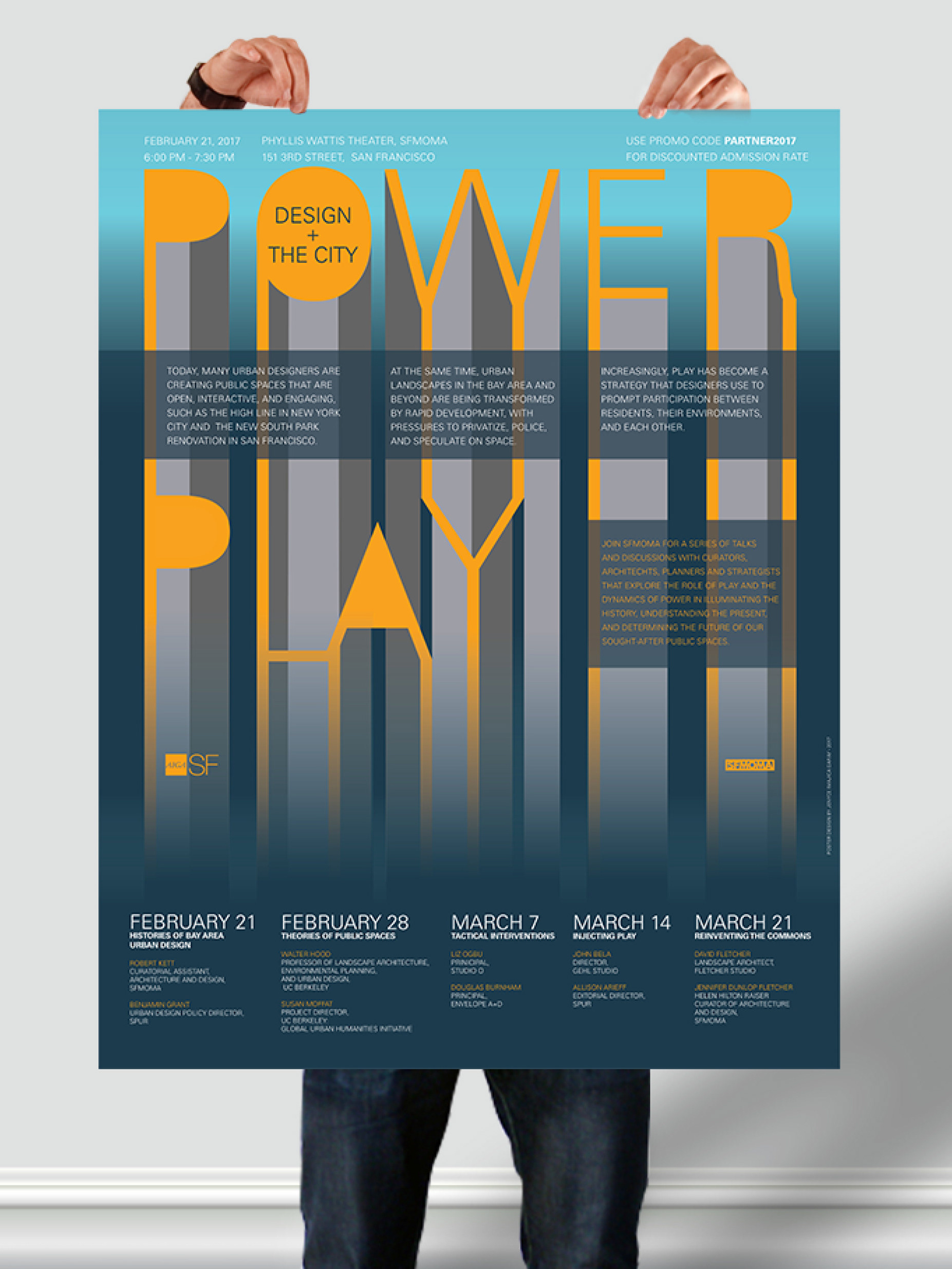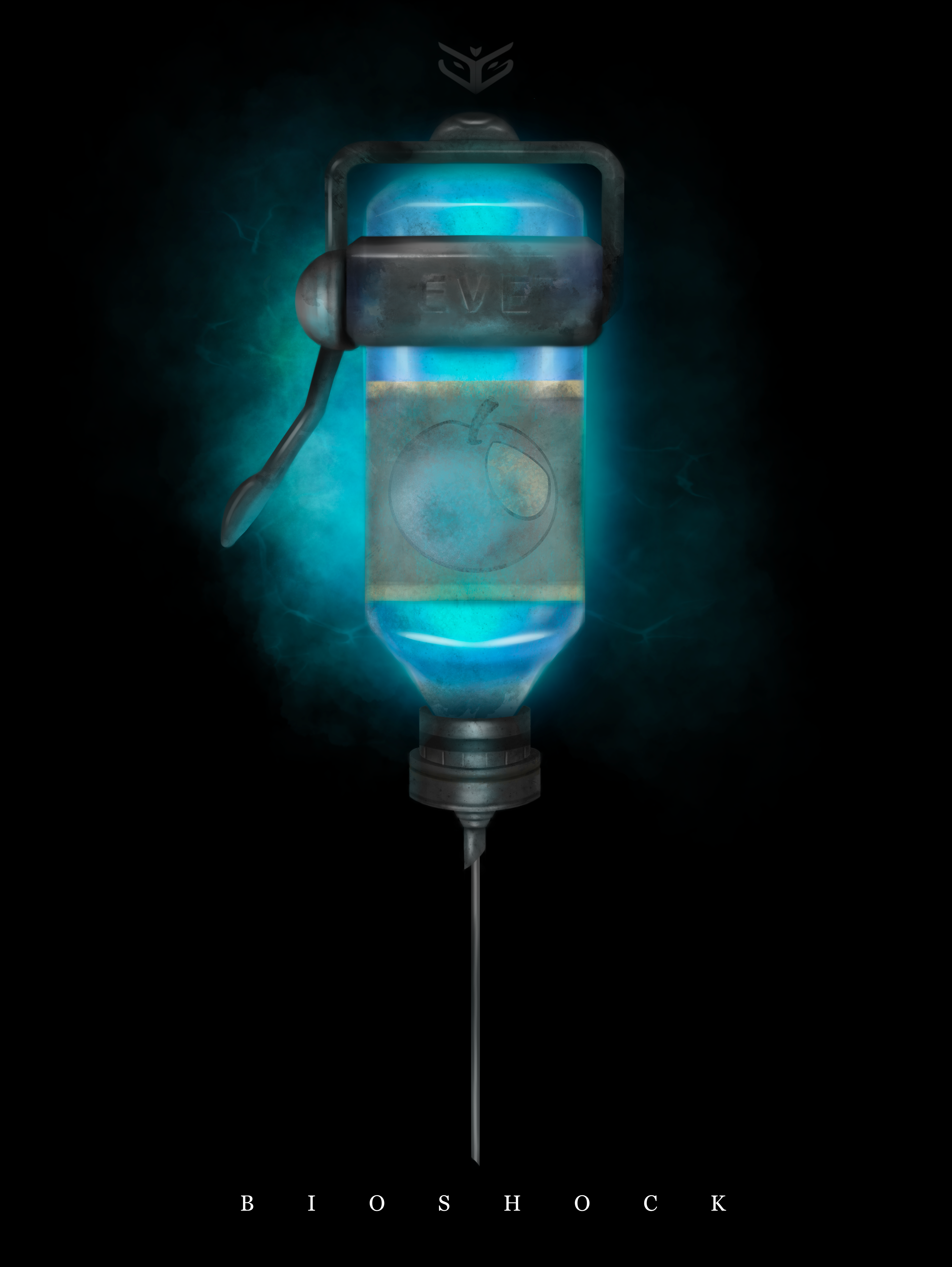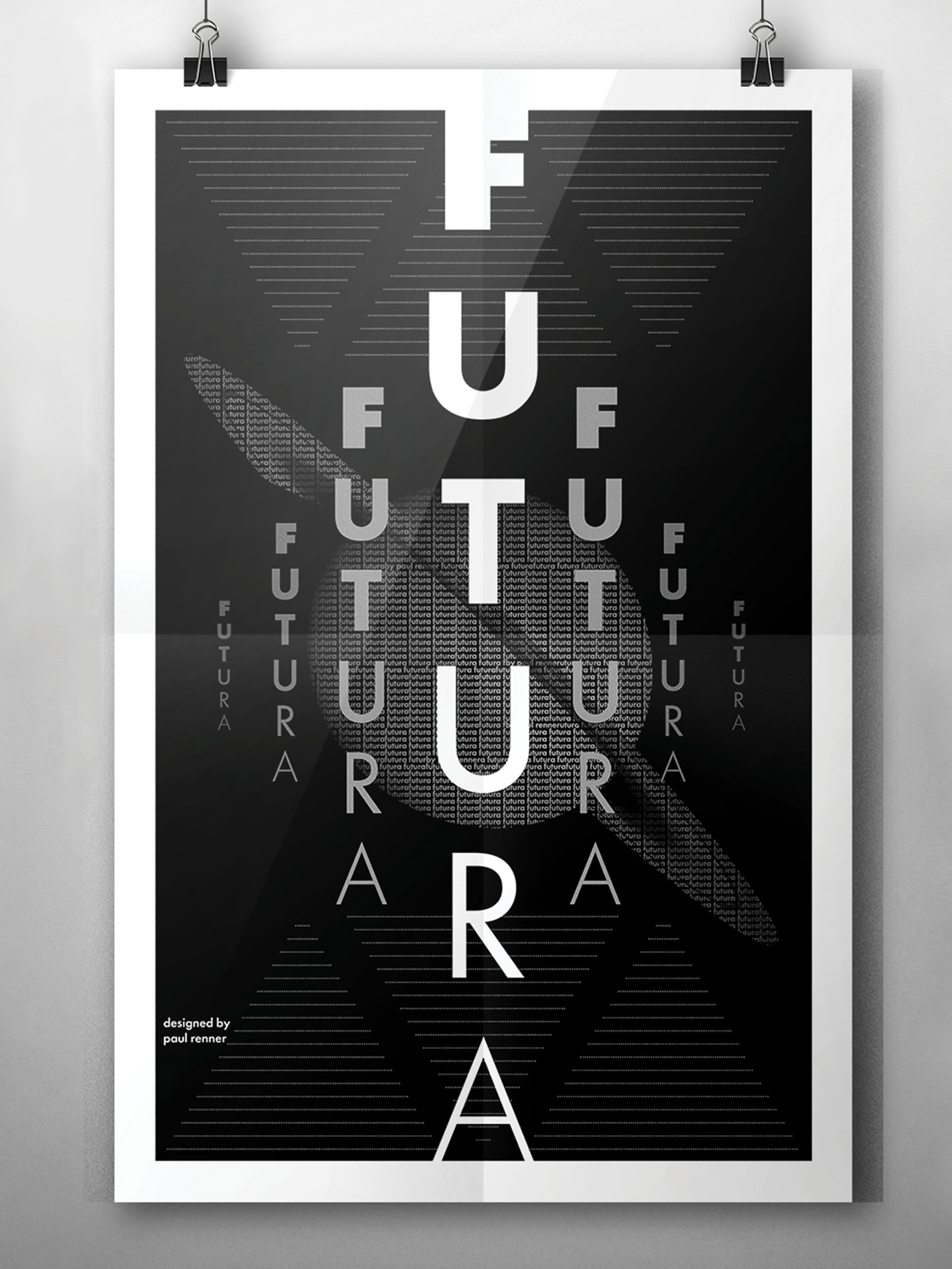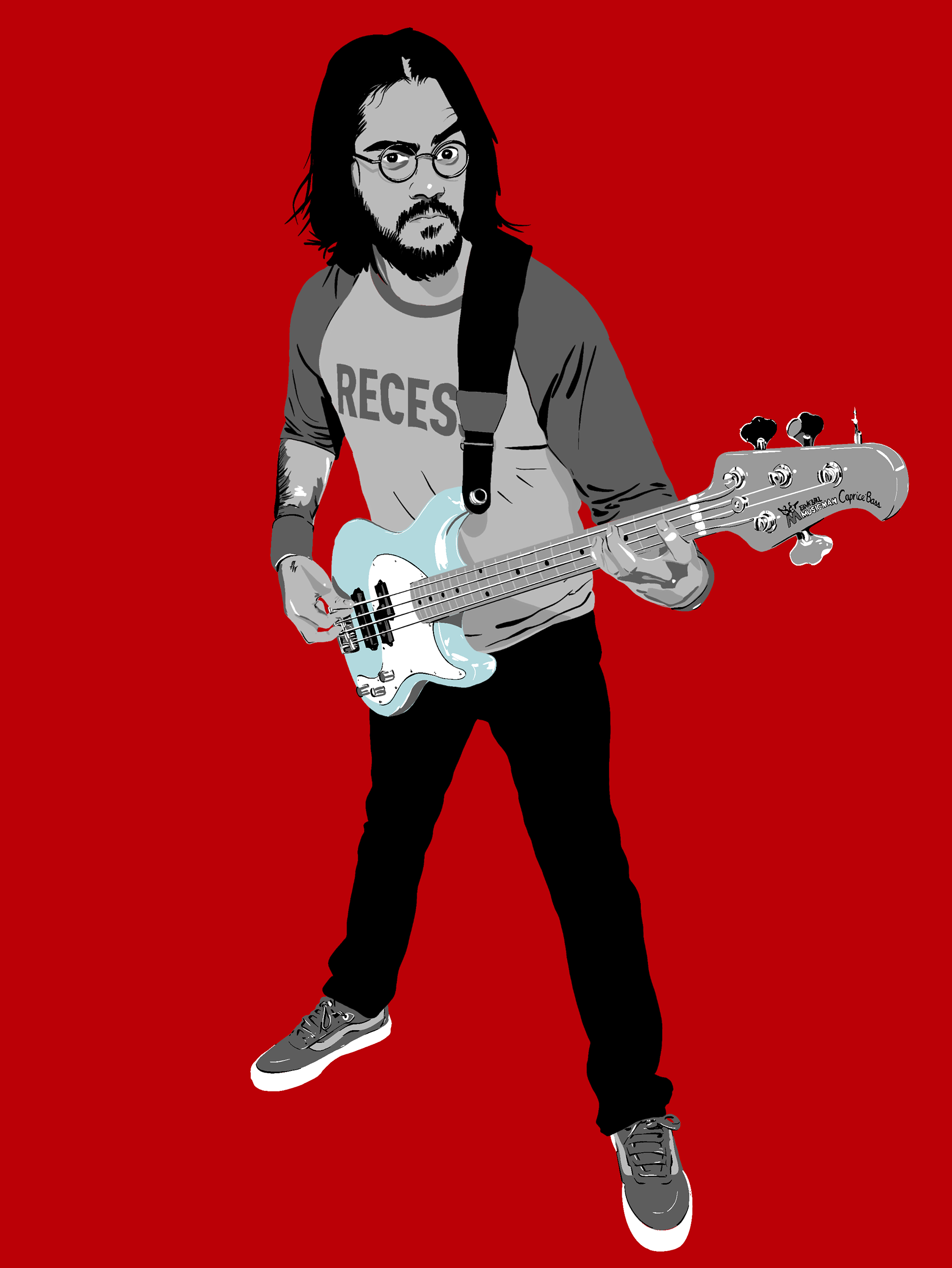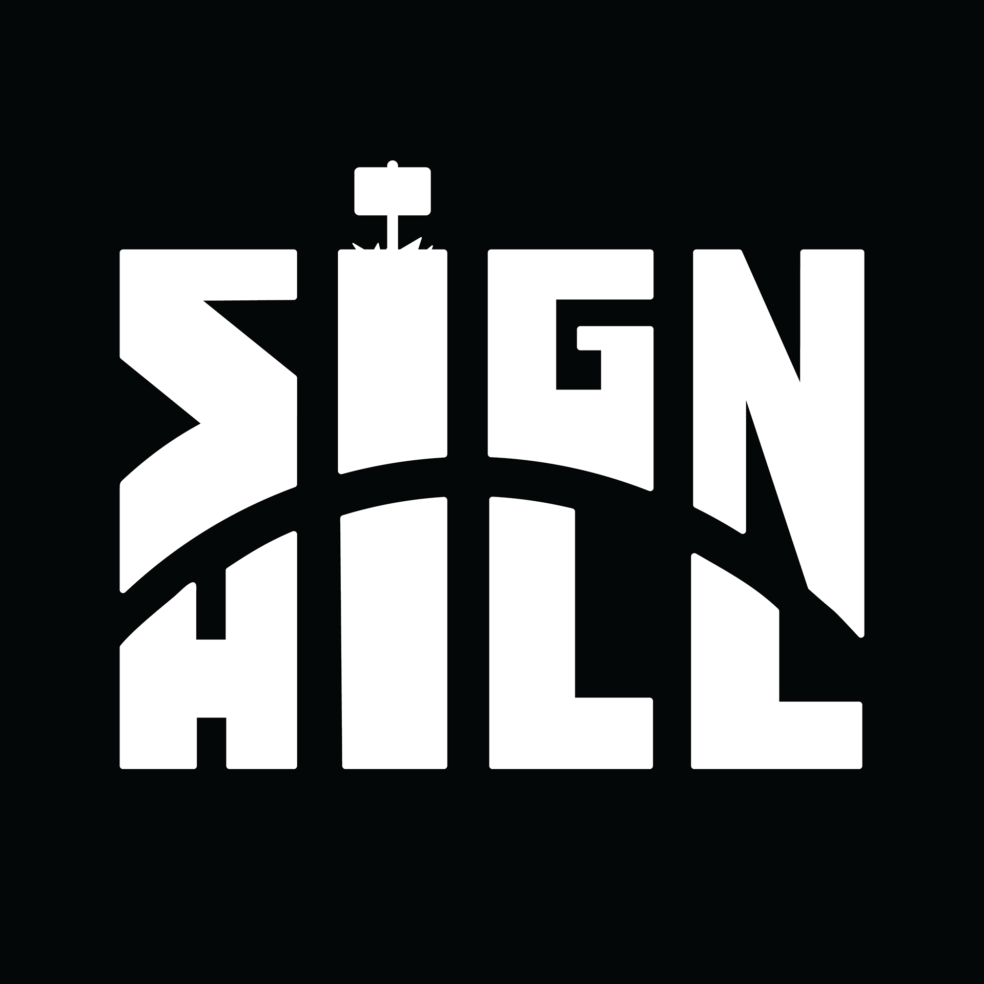
Final logo design

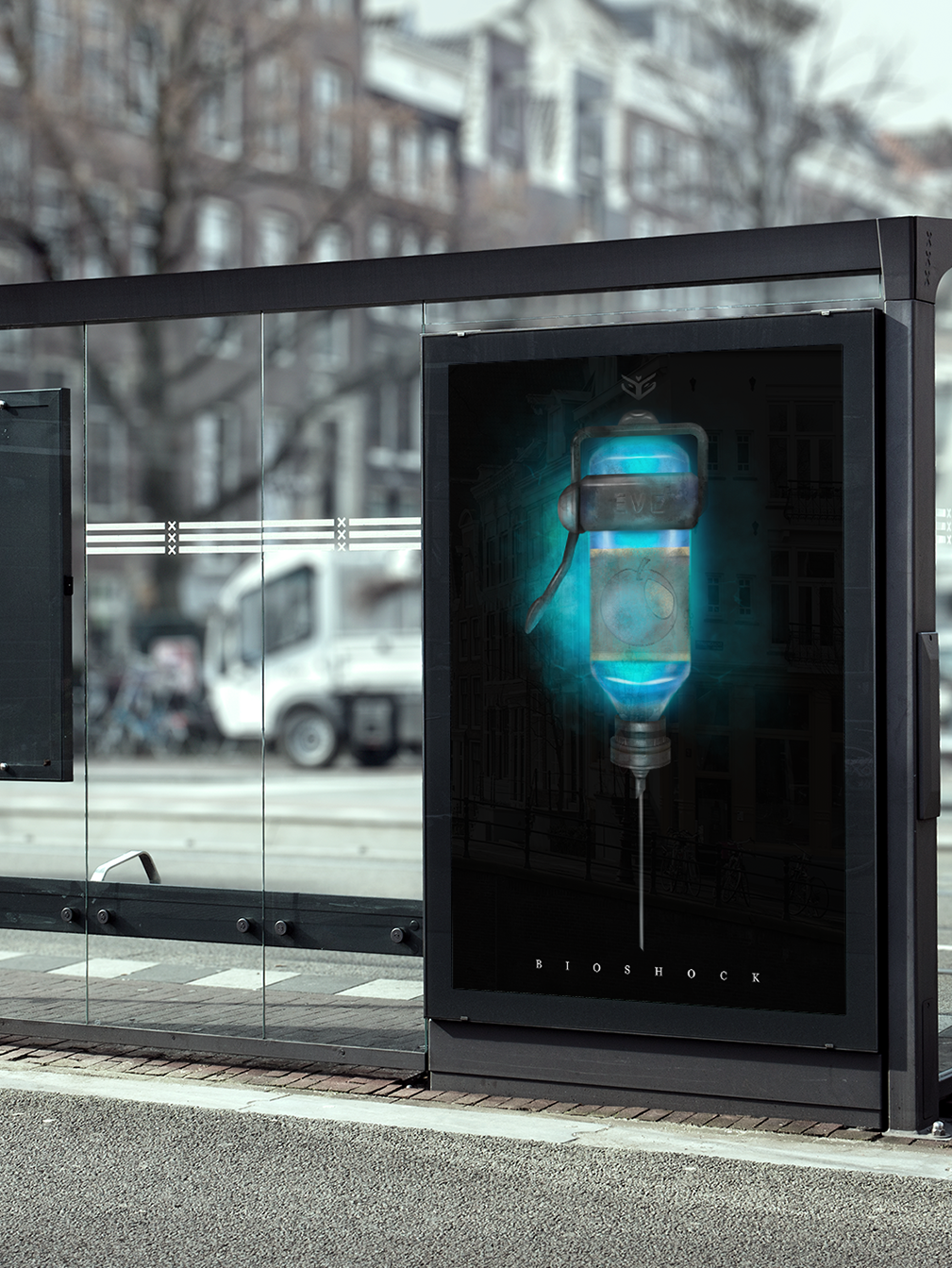
Logo in Use With Banner Illustration
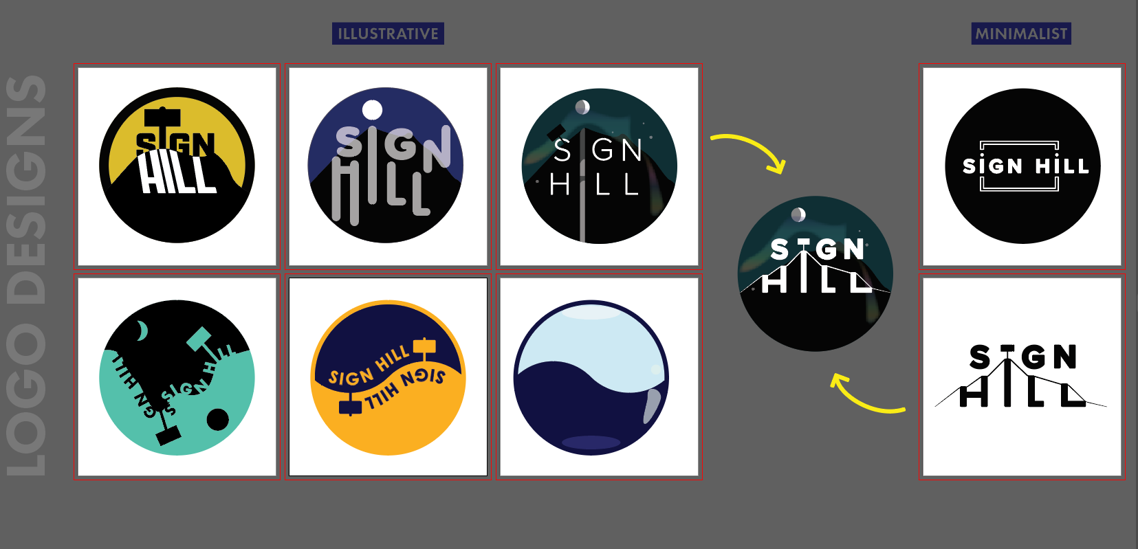
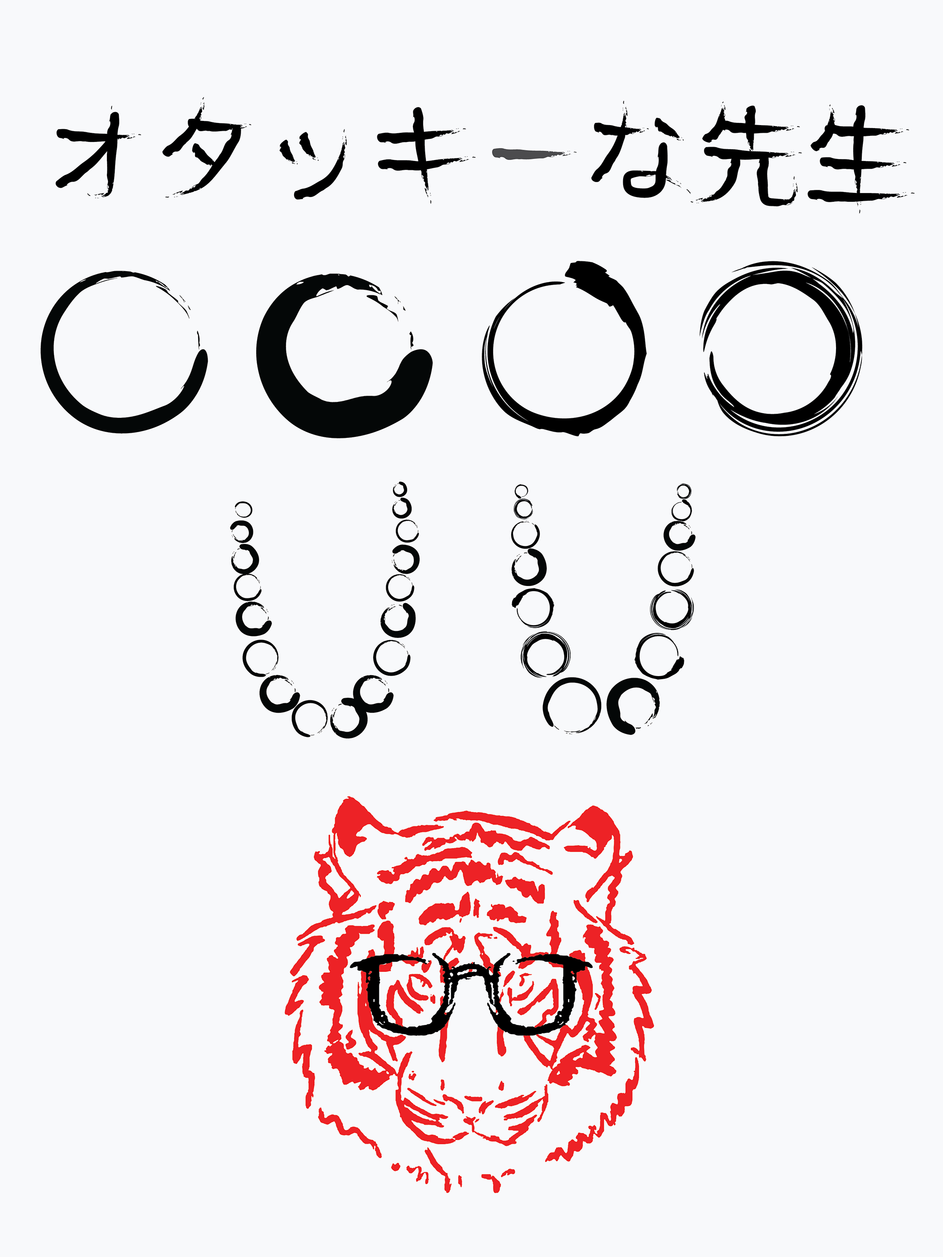
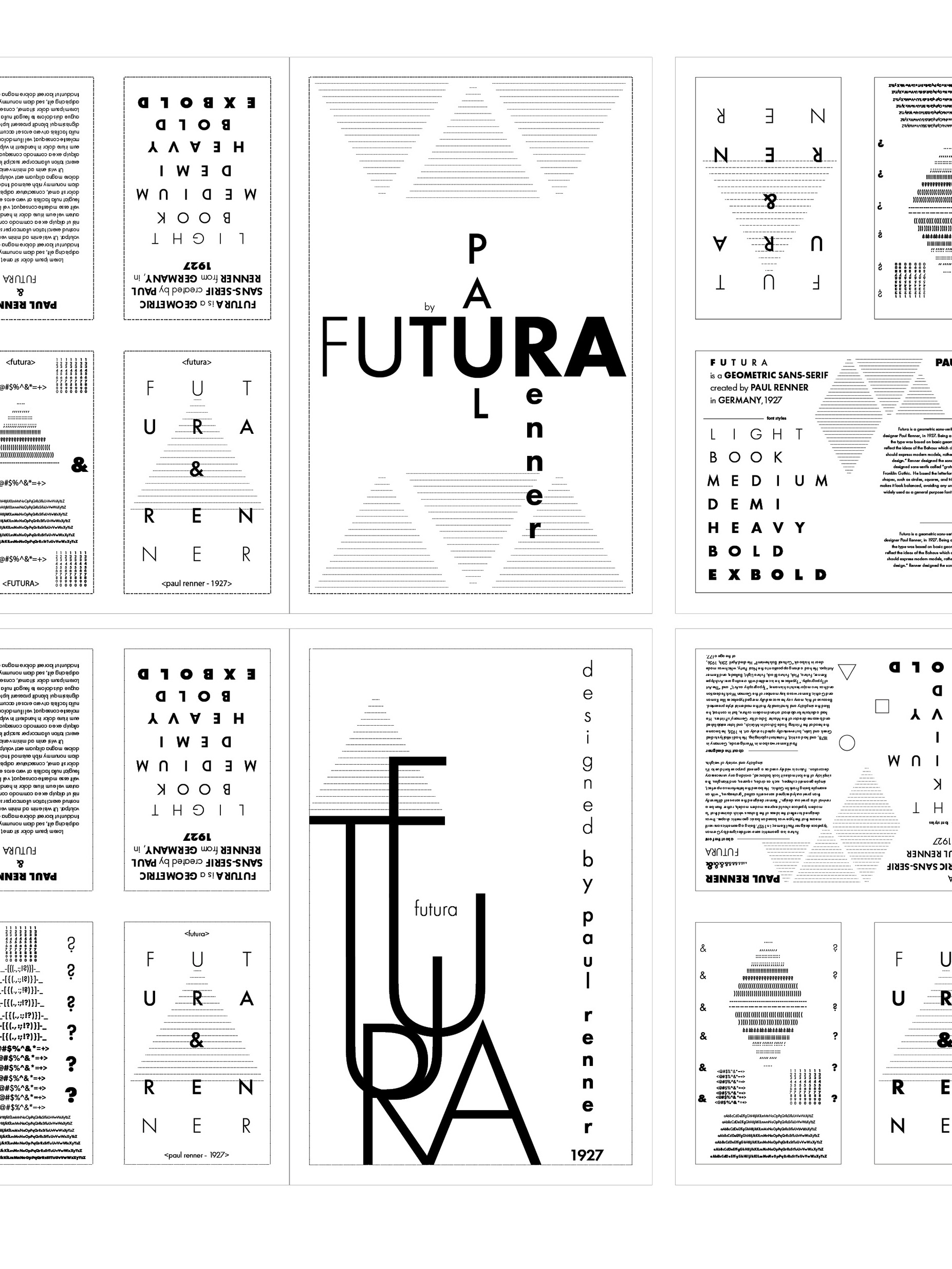
Working Iterations
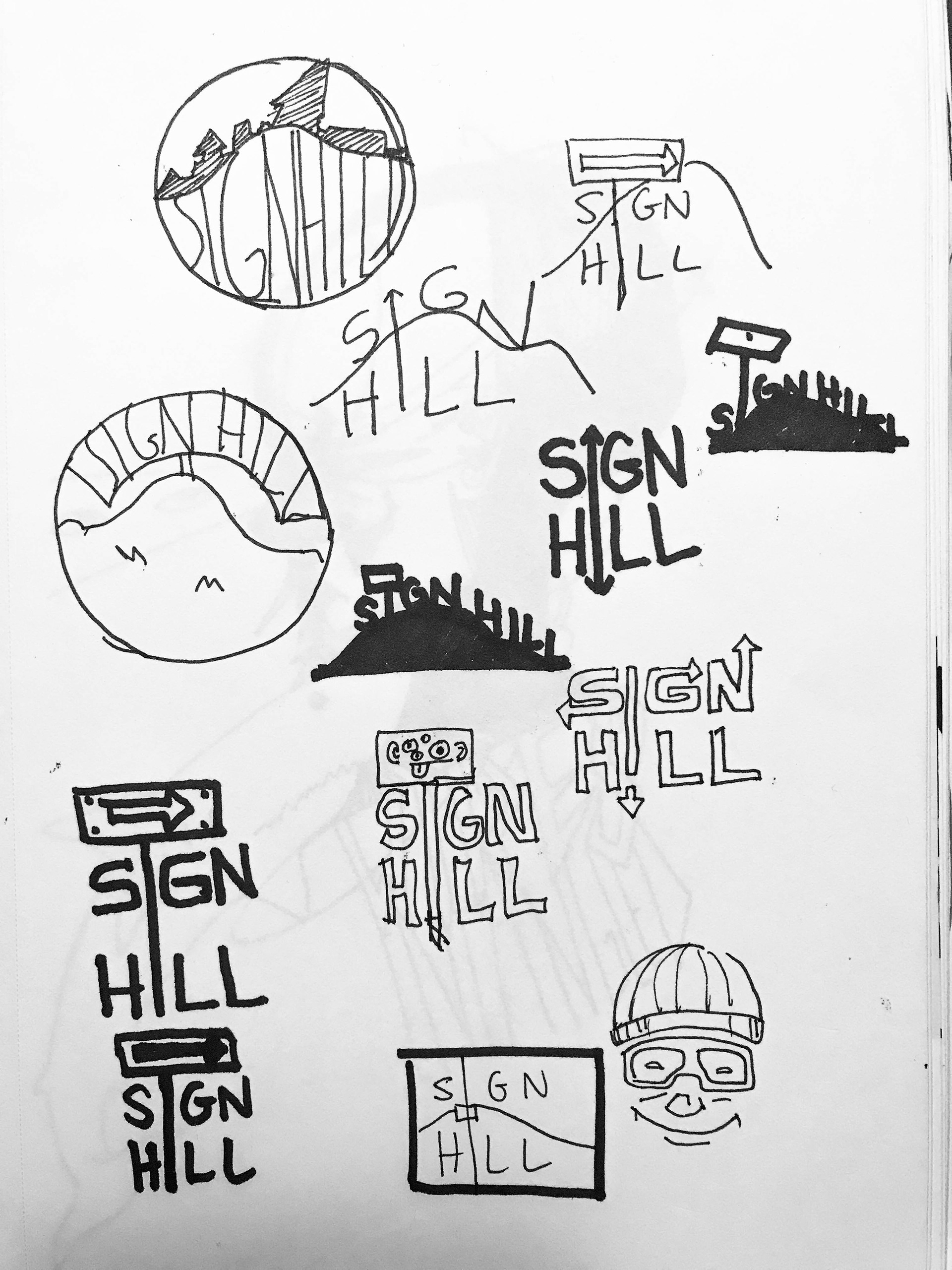
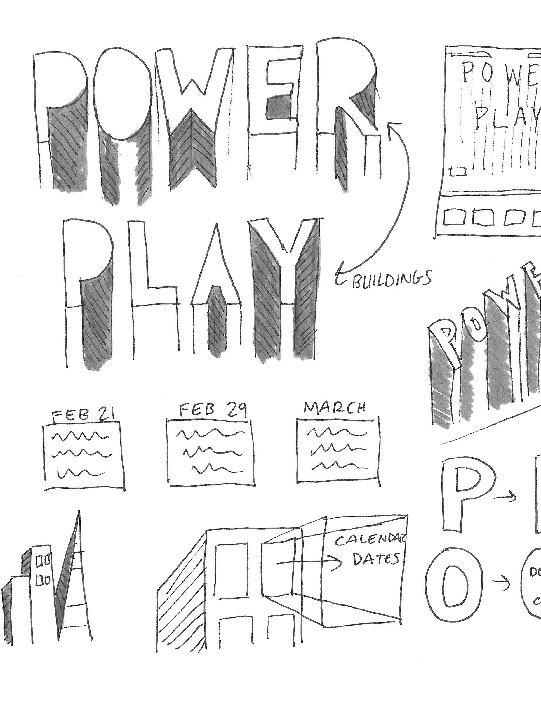
Sketches
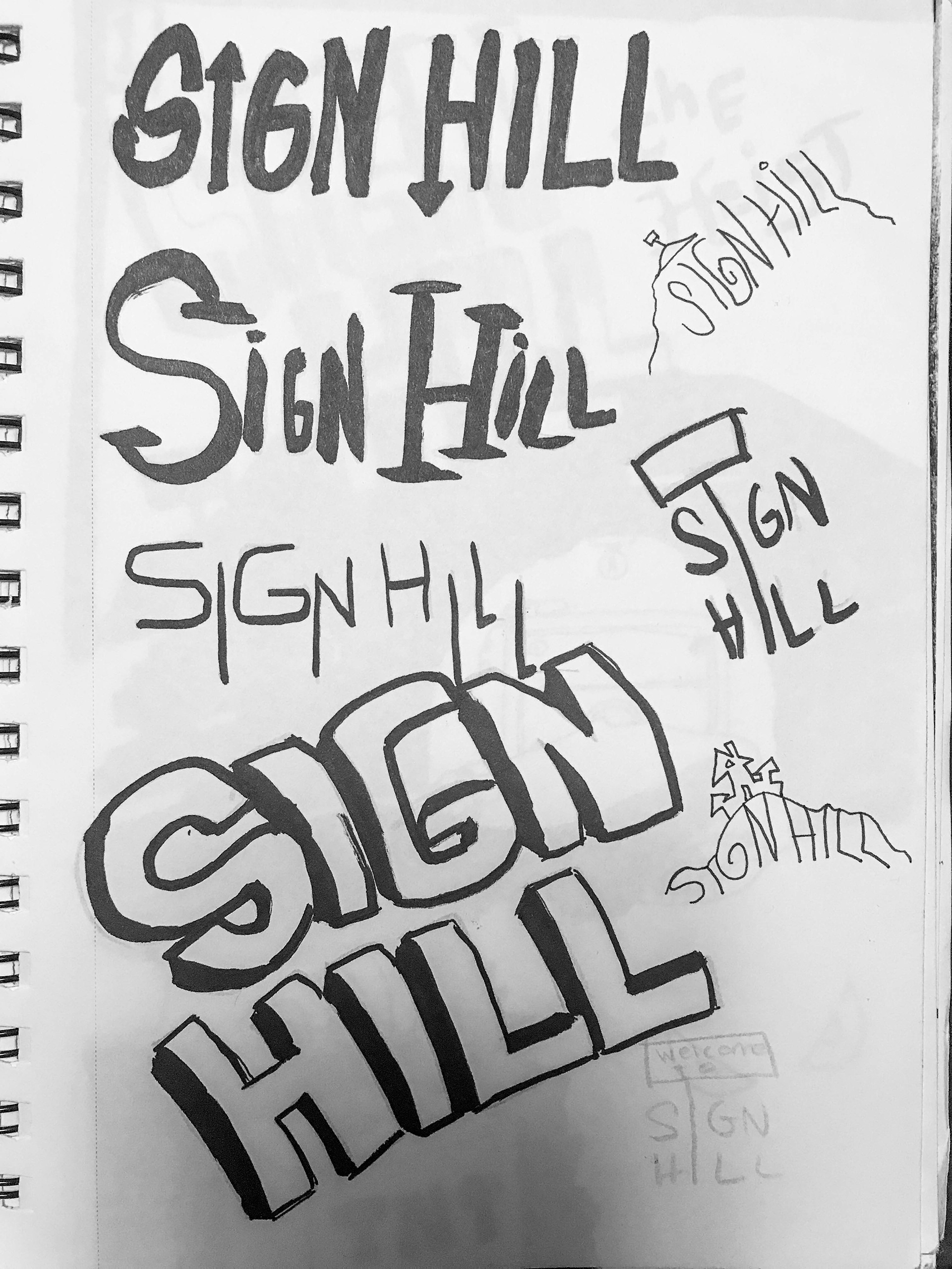
Sketches

Final Sketch
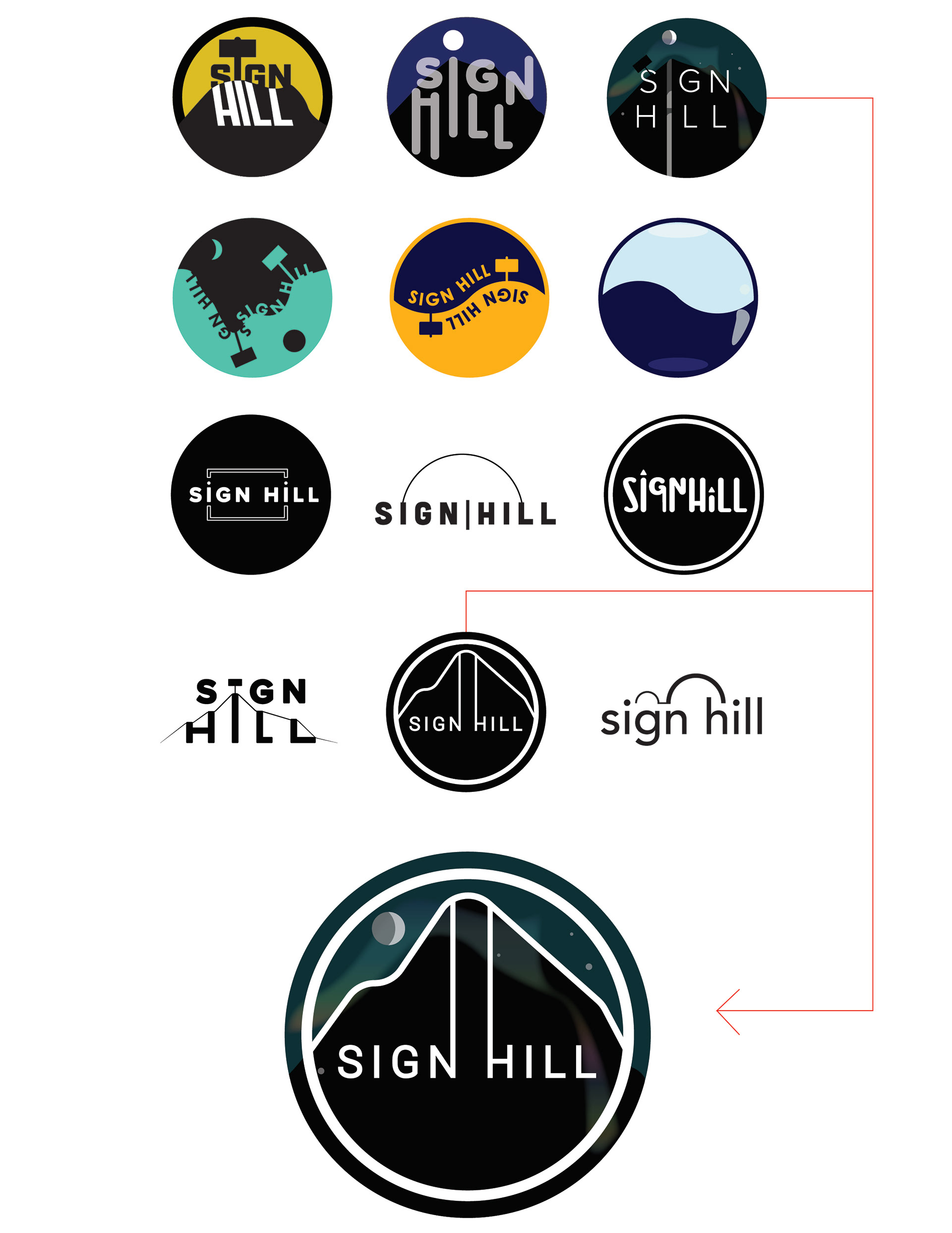
Iterations


A logo design for a local band in South San Francisco. For the first round of iterations, the initial designs were illustrative, and the secondary designs were minimalistic. The placeholder logo was a combination of two of the designs, bridging the gap. However, the final logo was decided on later when the group figured out an identity and style they were going for, which was dark and cartoony - like L.A. Noir meets Calvin and Hobbes.